Assignment four. Second part
- Marina WitteMann

- Jul 16, 2019
- 3 min read
Updated: Jan 12, 2020
Figure study using tone – Reclining model


A1 sheet size - 594 x 841 mm. Charcoal, iPad drawing, oil pastel, watercolour, UV light, fluorescence acrylic, acrylic colour and projection.
Inspiration
1. Valentin Serov and Konstantin Korovin

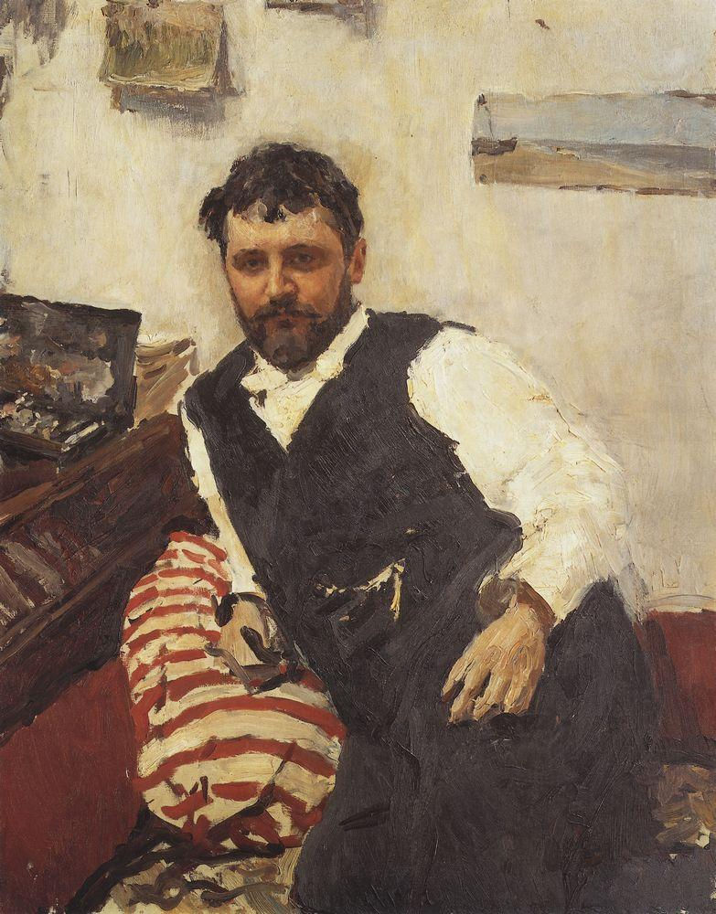
Valentin Serov (1891) Portrait of artist KA Korovin [Painting] At: http://vserov.ru/kartina/4.php (Accessed on 15.07.19)
2. Matthew Stone
3. Andy Warhol
Valentin Serov, portrait of Konstantin Korovin
I was in love with this artist. I read his book and saw the originals of "all" of his works. Konstantin Korovin loved life and enjoyed every moment of it. He interpreted the Russian soul through a complex color and strong compositions. His friend Serov was the exact opposite of him, but in this portrait, he conveyed the essence of Russian’s artist personality.
When I read the assignment task of this course, the first thought that arose was this particular portrait. Firstly, due to personal sympathy for the person depicted at work, and secondly, relatively recently (in 2015;)), one of the largest exhibitions by Serov (the author of this work) was held in Moscow. The collected paintings in one place made a huge impression on me. How the master felt the model, how he worked with colour, how he built the composition, conveyed the atmosphere. Thirdly, my tutor already advised me to take a famous work as a basis and try to work with it. I thought this was a great opportunity.
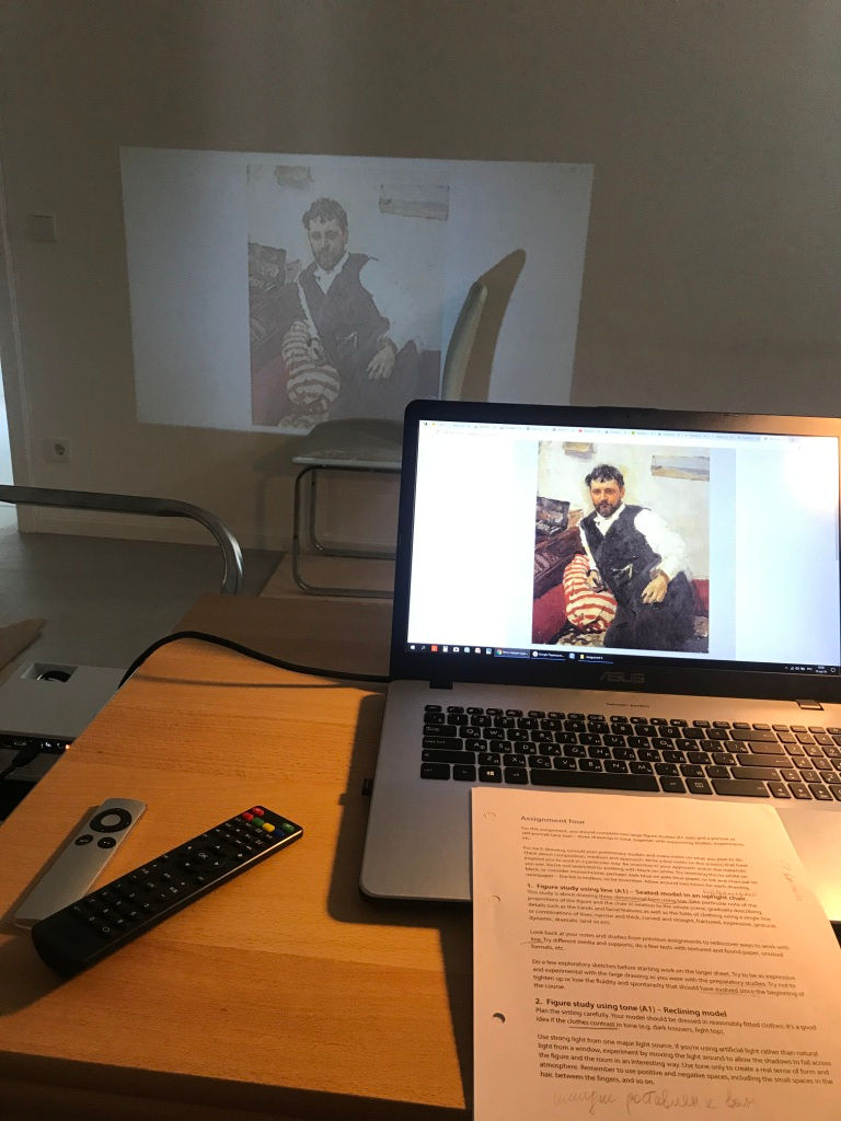
After the first part (model on the chair), I thought that I could not just look for the image for the task, but I could rework favourite painting photo and create another vision. The image suited to the tasks - contrasting clothes, reclining position and atmosphere.
I finally let go of the problem of "copying" the image from an existing one. For me, Andy Warhol and his words in an interview served as an example:
“Because it is easier to do” But we know that this was a great work behind the master.
Process of work
In the previous work (the first part) I did not use color, and here it seemed to me quite symbolic to start working with color, when Korovin was famous for his caloristics.

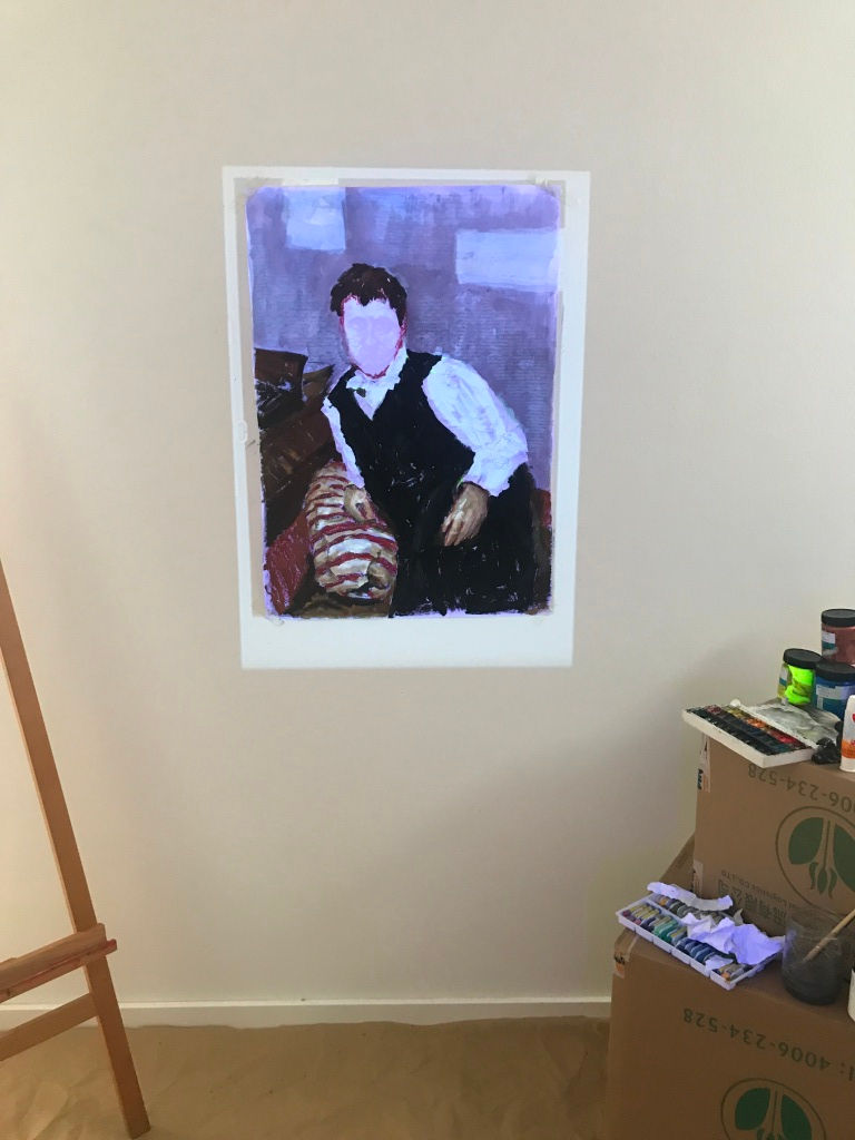
Therefore, I began to work with the disclosure of tone, composition and volume of forms. I wanted to enhance the spatial effect, so I applied fluorescent paint, which later had to be pasted with plain white paper. Simple paper glows from the UV light, thereby uniting all the work (like underlaying) and at the same time "tearing off", separating the work from the wall.
Next, I made a lot of variations on the face. What can it be, how should it look?
I wanted to add more digitality to the drawing, so I processed the pictures in the background and brought it out on a separate layer with a shadow. Here, if I had the opportunity, I would print the resulting image and use it as the basis for all subsequent work. (I will try this next time!)
Technical part
As a result, the work looks like a video in the drawing.
Playback speed can be reduced (the current option to reduce the file size). At the end of the video you can see how the work changes without light and video. Here I especially like the moment that work needs to be turned on, like a television set - to give impetus for further actions.
As a result, the face does not look like the original. I wanted to bring it to the similarity, but then I changed my mind because I did not see Korovin live, and this work is my interpretation. And so there will be more questions from the audience, knowing this work, why the body of one person, and the face of another.

Besides, it can be offered to the viewer to paint on the iPad face for this portrait. This way spectator will be involved in the process but on the other hand, he changes the subject matter. It will be no longer work about Russian Artist but it will be someone else in the body of the artist.


Comments